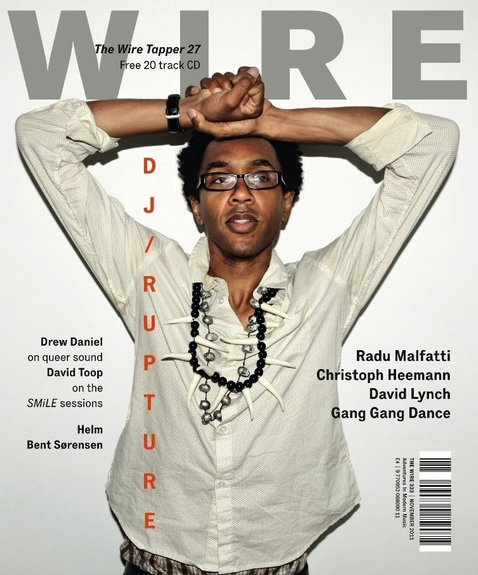
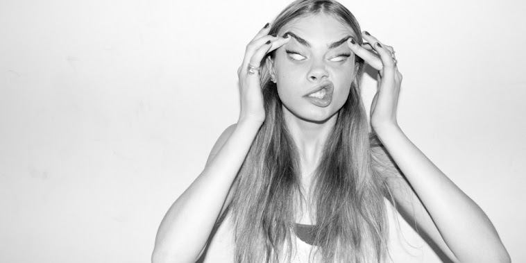
My magazine still incorporates a simple, modern and stripped down style as there is not a large amount of text or a variation of colours that feature on it. I used a colour pallette of black, white and red, avoiding any clashes of colour to keep the simple layout. The plain background used also is similar to the covers below as it is plain and neutral, also contributing to the simple, stripped down style. I took inspiration from magazines such as Dazed and Confused, Complex, i-D, and Wire. The examples below represent the style I was aiming to achieve and the inspiration that lead to the design of my front cover - they use simple fonts, colours and a limited amount of text is used. All of these features are stripped down and it creates, what I think is, a professional and modern style which coincides with the hip-hop genre really well. However, in the future editing of my magazine I aim to show a more dominant theme of music and of the hip-hop genre through the design of the front cover.


No comments:
Post a Comment