Thursday 31 January 2013

First Draft - Major Magazine


Feedback
This was marked by my teachers to give me a estimation of what this work would achieve if it was submitted and give me an idea of what level I am currently working at. I was given a level 2 for this work, which I was not happy with overall. The layout of the magazine was the main concern, especially in the contents page and double page spread. The list of sub-headings on the contents page following the line made by the wall was said to have no relevance to any other elements on the page and looked a lost on the page overall and didn't work. There were elements of the double page spread which I will have to change if I want to keep the same layout, such as considering how the text/main image will be cut due to the fold in the page. I have discussed these issues with my teachers and have decided upon possible changes that I could make in a second draft in order to gain a better grade. However, the style of my model was praised by my teachers and the shots that were taken were high-quality, and captured the attitude/character of the artist, which reflects the genre of my magazine well. The font for my masthead was also said to be strong and bold, and the contrast with the sub-heading made the two opposing fonts compliment eachother well.
I will have to make some significant changes to my magazine layout in order to achieve a higher mark and I am in the process of deciding upon a date for a second shoot with my model to get some different shots.

Wednesday 30 January 2013

Test Shots for Mock-Up Magazine

DSC_0382DSC_0380DSC_0381DSC_0378DSC_0377DSC_0376
DSC_0375DSC_0374DSC_0373DSC_0368DSC_0363DSC_0362
DSC_0361DSC_0359DSC_0358DSC_0357DSC_0356DSC_0355
DSC_0354DSC_0353DSC_0348DSC_0347DSC_0346DSC_0345
Media Mock-up, a set on Flickr.
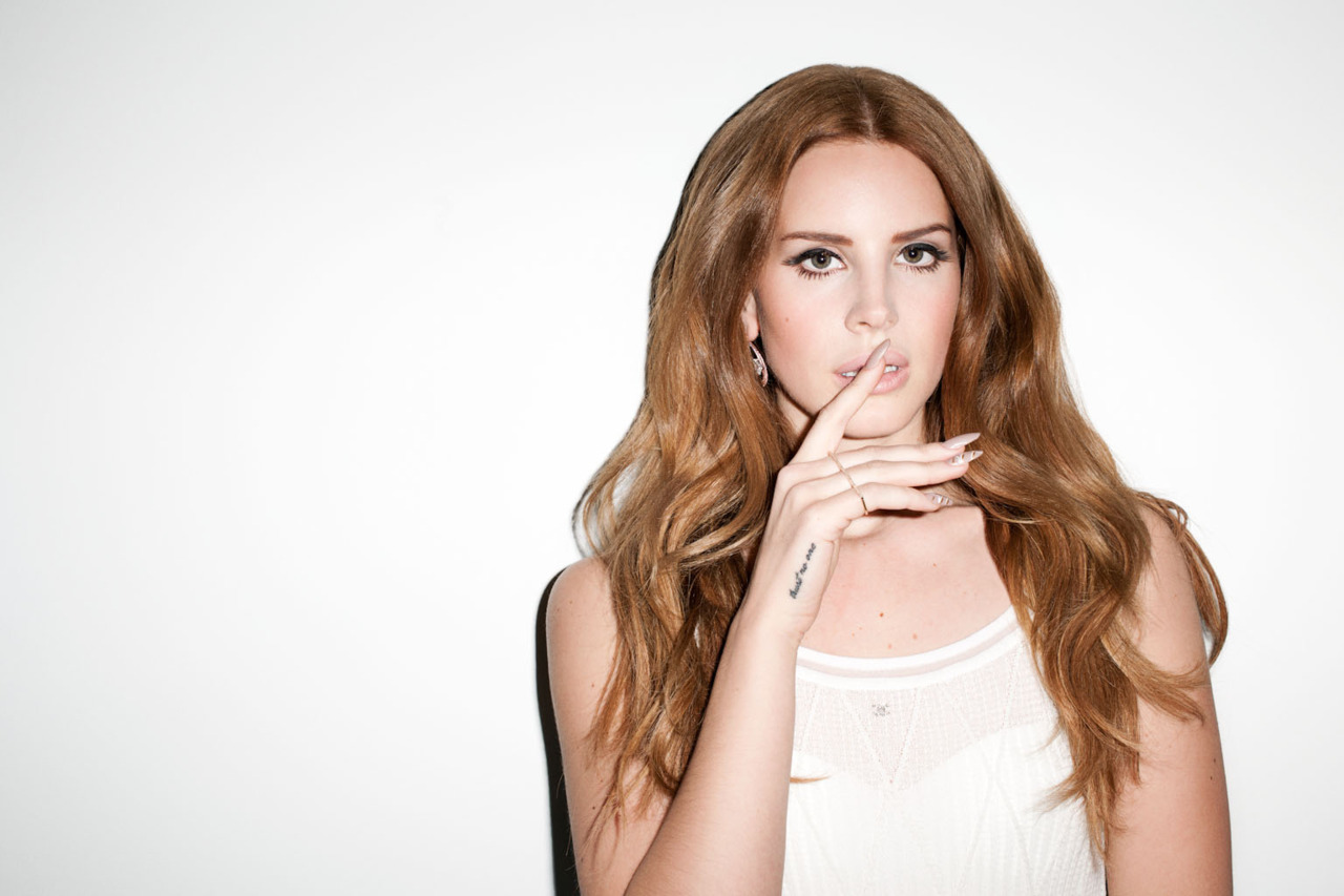
These are some of the test-shots I took of my model in preparation for my mock up magazine. I like the neutral setting I used here and the type of shots taken. However, I would definitely consider changing the costume in my next batch of shots as I feel these costume ideas didn't look 'high end' like they would be expected to look in a hip-hop magazine. I organzied this shoot with a friend on the 27th January and had already thought about the camera I was going to use and the costume/make-up. In future shots I want to include more than one model to create variety within the photo's. I will have to consider how I will incorporate this into my magazine as my model is a solo artist, therefore it may be difficult to realistically involve a second model.

Mock Up - Major Magazine


Artist Profile

Artist Profile
Name: Libby Zarong
Music Style: Hip-hop, rap, electronic, urban.
Influences: Hip-hop - Azealia Banks, Kanye West (Late Registration album style), Iggy Azalea, Jay-Z, Pharrell Williams, N.E.R.D, Justin Timberlake, Childish Gambino, Delilah, Lauryn Hill.

Cover
(Neutral/plain background to avoid clashing with costume/make-up)

Style: Pose showing attitude, bold/bright/busy clothing, messy hair, red lips, full make-up, feminine, fresh/expensive looking costume.


Tuesday 29 January 2013

Evaluation of Class Feedback

As a result of giving my pitch on, both my teachers and peers gave feedback as to what they're opinion is on my initial idea for my magazine. Some raised questions and others praised elements of my magazine, which, consequently, gives me confidence to pursue that idea.

One issue raised was the choice of model/s that would be the focus of the magazine and who would be on the front cover, contents page, and double page spread. This is a key choice as the model/s would be the main image and the focus of the whole magazine, and therefore if the model does not reflect the genre of the magazine, does not look aesthetically pleasing alongside the other elements of the magazine, or 'fit' the design, then this could have a negative effect on the whole magazine.
After discussing this issue with peers, I have decided to base my model/s appearance/clothing/attitude on that of the female rapper "Iggy Azalea". I have chosen this artist as a model to base my own model on, as she represents the modern urban/hip-hop genre that I am aspiring to achieve and always stars on interesting magazine covers/photo shoots.
The choice of title for my magazine gained a lot of praise from my peers and teachers after I presented my pitch. The name 'Major' has a lot of depth to it regarding the genre of the magazine, as the magazine will include major, and upcoming, hip-hop artists. As well as this, the fresh, young urban 'scene' is becoming a major genre in the music industry, developing in terms of music and image. The magazine will also be published majorly, overall creating a Major magazine. This depth and explanation of the title was praised and the impact of the word 'Major' alone was also mentioned. Therefore, I am confident that I will use this as a final title for my magazine.

Another issue that was discussed as a result of my pitch was the location of which the photo's for my mock-up magazine will be taken. After consideration, I have decided that I will take the photo's with the model/s up against a blank wall or white screen to create a plain background, which can then be edited easily later on as a result. I wanted a simple mise-en-scene to create a modern appearance of the magazine and therefore a blank background would be suitable in achieving this.

I also discussed a price of £4.20 for my magazine, and the number of pages would be a minimum of 120. I think this is suitable considering the target audience, as the younger audience will still be able to afford the magazine at this price, however it is still at a price so that the magazine can be of high standard and quality and the pages can be glossy. The number of pages (120) would also be appropriate as it is a monthly magazine and therefore will be expected to have more content than a magazine that is released monthly, for example. The amount of content also reflects the price of £4.20.

Monday 28 January 2013

Audience Research

UK Tribes research
This is an analysis of the audiences that I aim to appeal to through my magazine, found on the Channel 4 website UK Tribes, to give me more of an idea of what my audiences are attracted to and interested in when concerning the media.

Trendies
Trendies were once an exclusive tribe, populated only by those with the access, knowledge and cash to spend on fashion. Now almost anyone can be fashionable thanks to the speed with which trends fly off the catwalk and into high street stores. The Trendies Tribe is increasing and with growth comes dilution and the potential for a reaction against this. How can Trendies be trendy if everyone is cool? 
The aesthetic awareness and thirst for new trends is blossoming across youth culture and drawing in new members. Accordingly, having the newest look or knowing about the newest trend is easier but means less than it did ten years ago. It's still important for the older section of Britain's youth though – Trendies tend to be in their early/mid 20s and are generally middle class. The Trendies Tribe is growing so significantly that fashionistas, a term once used solely to describe east London would-be stylists and fashion darlings, is growing in currency across the UK and is now used in more general terms to describe a more-trendy-than-average trendy. 
It's all about vintage for trendies. One-off pieces from eBay or charity finds are key, combined with staples from Topshop, H&M, Primark and Urban Outfitters, and designer goods which are increasingly pitched as realistic options for Trendies, like Acne, Luella, See by Chloe and Folk. Fashion heroes are Alexa Chung, Kate Moss and Daisy Lowe. Musically, Trendies are drawn to whatever is fashionable and tend to like things in the period just prior to their first hit and the release of their second album. They tend to like acts that are just about to make it big and once they have gained complete mainstream status, they move on.


Urban
Urban music is the most pervasive and influential genre in popular music, topping the charts around the world and sound-tracking the lives of many different Tribes. Members of the Urban segment are therefore very close to one of the biggest cultural signifiers in the youth market – although in planning terms, genuine Urban segment members make up a small slice of the market.
The Urban segment follows a typical pattern, with a small subset (the DIY-ers) who create and dictate tastes, and consumers who buy into the tribe and endorse that creativity in the shape of Blingers, Get Paid Crew and Trackies. Urban fashion and music extends into mainstream publishing and TV, but the core Tribe members are most influenced by what they see around them in their urban environments, in clubs and on social networks. YouTube, Myspace and Facebook are the most effective conduit to these kids.
Trackies are enthusiasts who don’t produce but enjoy consuming music and film with their friends. Their hooded tops are intimidating but their conversation is friendly, open-minded and laid back. Blingers are preoccupied with US music and icons, and spend big on label fashion. They are sometimes mocked, but everyone has a bit of Blinger in them. Get Paid Crew are a brash version of the traditional working classes, unashamedly driven by money but proud of their urban background. DIYers have identified the core of their lives, understanding their own culture and making music and media for themselves, with a lively local market and occasional global break-outs.


Leading Edge
Leading Edge tribes are the smallest segment in the youth market. However, they drive taste across virtually all other sectors, impacting on the listening habits and fashions of everyone from rural teenage Emos to the stars of US hip hop. These tribes stand at the gateway of popular culture, and are the main influence over other Tribes like the Young Alts. However, all of these Leading Edge Tribes are hard to manipulate. 

Inspiration


Melissa Bell and Katherine Webster in "She Got Game", shot by Tim Ashton for Fashion Gone Rogue. Styled by Monique Moynihan, the shoot features designers such as Just Cavalli, Addidas Originals X Jeremy Scott, Ksubi, and Nike.
I particularly like this shoot as it incporates a plain white background, which is what I intend to use in my magazine shoot, however then contrasts this with bold, busy, clashing and colourful costume worn by the models. There is also a varied use of camera shots, including mid-shots and long-shots, with one or two models used in each shot - which is the number that I intend to use, as noted in my pitch. As well as this, the models are in interesting poses and Tim Ashton captures these well in his photograph's - this is something I hope to present in my shoot for 'Major' Magazine. The costume used in this "She Got Game" shoot also reflects the genre of fresh urban/hip-hop that my magazine focuses on, so is yet again something I can think about when considering the costume of my model/s for my magazine.


Magazine Cover Construction Task

The task was to construct a music magazine cover in one lesson. Here are the stages of creating my magazine and the final product.

I chose this image as it is an interesting shot of the artist Lana Del Rey. I minimized the image so that the model did not fill the entire cover, leaving little/no room for text. Then, I filled in the remaining background using the same colour of the original background of the picture, via use of the eye dropper tool.

'DEADLINE' appealed to me as a name for this magazine as it coincides with the main image, for example, the blood dripping from Lana Del Rey's mouth and the dead rose. The font is bold and unmissable to the reader and the colour white stands out above the dark colours used mainly for the main image, except for the pale colour of the model's face.


I wanted to keep the cover looking simplistic and modern. Therefore, I used the same font 'Zanzibar SF' for the masthead as well as the subheading and strapline, creating consistency throughout the cover. I also continued using the colour white to ensure this simplistic idea was to be effective.

For a realistic effect, I then added a barcode to the bottom right corner of the page. However, consequently, I moved the subheading and strapline slightly up, as the barcode looked too close to these seperate elements, creating a busy and messy appearance.