


Feedback
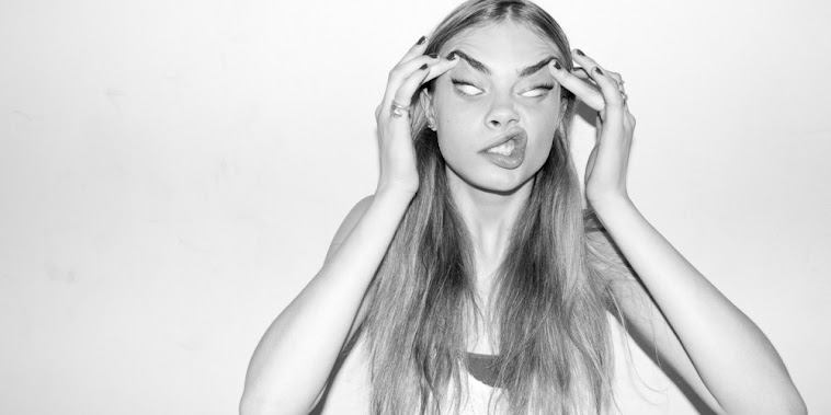
This was marked by my teachers to give me a estimation of what this work would achieve if it was submitted and give me an idea of what level I am currently working at. I was given a level 2 for this work, which I was not happy with overall. The layout of the magazine was the main concern, especially in the contents page and double page spread. The list of sub-headings on the contents page following the line made by the wall was said to have no relevance to any other elements on the page and looked a lost on the page overall and didn't work. There were elements of the double page spread which I will have to change if I want to keep the same layout, such as considering how the text/main image will be cut due to the fold in the page. I have discussed these issues with my teachers and have decided upon possible changes that I could make in a second draft in order to gain a better grade. However, the style of my model was praised by my teachers and the shots that were taken were high-quality, and captured the attitude/character of the artist, which reflects the genre of my magazine well. The font for my masthead was also said to be strong and bold, and the contrast with the sub-heading made the two opposing fonts compliment eachother well.
I will have to make some significant changes to my magazine layout in order to achieve a higher mark and I am in the process of deciding upon a date for a second shoot with my model to get some different shots.
I will have to make some significant changes to my magazine layout in order to achieve a higher mark and I am in the process of deciding upon a date for a second shoot with my model to get some different shots.
A promising start. Some issues in terms of layout that i'll talk to you about in class.
ReplyDelete