Showing posts with label double page spread. Show all posts

Thursday, 14 March 2013

Double Page Spread Article Layout

On my double page spread I have decided to layout the article in to two columns rather than three. I have chosen to do this and go against the conventions of the typical music magazine because I think that having two columns of writing instead of three creates a de-cluttered, simple style, which coincides with the design on the front cover and the contents page. I attempted moving the text into three columns, however this looked too busy and was not consistent with the style of my previous pages. Therefore, after making adjustments I felt that it was best to use only two columns to continue with the modern, simple, stripped down design of my magazine.

Monday, 11 March 2013

Photoshop Work

In this screen shot I am editing some features on my double page spread. I am increasing the size of the margin either side of the article and at the top and bottom of the article. As well as this, minor changes need to be made to the article itself, due to a rethink in the writing.

Friday, 1 March 2013

Final Draft Article

Libby Zarong. The name that’s been circulating the office here at Major Magazine for weeks, and the one that would be unfair not to share with you. Libby Zarong, the 20-year-old Londoner has proven to be one of music’s most intriguing new shape-shifters since she started posting songs and videos online a few years ago. Fast-forward to today, and her feisty single “Did You Know?” has amassed more than one million-plus YouTube views. What’s fresh about Zarong is h ow she combines ludicrous charisma with lyrical naughtiness, and ground-breaking bass lines whilst spitting unforgettable rhymes in the process. “I’m aware of the negative audiences I’ll reach through my music. Hip-hop reflects the truth that society tries to conceal, and that is what I intend to voice,” says Libby, who studied fashion before she took to the music industry. Her honesty and attitude fully emerges once she steps in front of a camera, as proven today at the photo shoot for Major. The first day we met her she was somewhere between shy and standoffish. When I showed up at her hotel the morning of the interview she politely invited me to come along, “Just don’t ask me a million questions, please.” Zarong oozes with confidence, not phased by the racial comments being made and stereo- typical views constantly being preached to her that white women should not rap. “I don’t want to talk about this anymore, why can’t a British girl rap?” Libby groans, “I guess it’s just another thing to set me apart from other artists.” Understandably, Zarong doesn’t want anything to affect her speedy, flawless victory that she’s accomplished so far. She’s already collaborated with Pharrell Williams - American rapper, singer, record producer, composer, and fashion designer - and signed a major record deal with Def Jam Recordings, which is yet to confirm the release date of her debut album later in the year. Not to mention that she’s already got her hands on a Brit Award for the Critic’s Choice of 2013. With Def Jam Recordings managing her every move, it’s not surprising that Zarong has already began to crack America, starring and performing on the Ellen Show, “Featuring on the Ellen Show has been a great experience of mine. To be in America and to be doing these shows is just unbelievable,” says Libby. It’s about time that a British girl crashed onto the hip-hop scene and became more than just a one-hit-wonder, and it looks like Libby is about to do exactly that. It’s been quite a journey for Libby Zarong, whose current fame-filled and chaotic lifestyle contrasts to her tough beginnings in life: Her mother died when she was twelve, and so she was raised in London by her father. “I get noticed, even when I’m underwear shopping... It’s weird,” Libby says. “It’s all came at once. For me, a 20- year-old girl from Camden, it’s like... You know... How does this happen?” Libby Zarong has already performed at Coachella festival alongside Azealia Banks, V Festival, and Glastonbury, with massive turn outs at each performance, shaking up the hop-hop scene and changing the conventions of the typical rap artist. We asked her if she has any festivals or gigs lined up already for this year, but all she revealed was, “I like to surprise... All I’ll say is that I am very excited about one festival in particular!” Alongside her unique lyrics and beats, her style makes her stand out from the rest. She’s been praised for her daring outfits that come to her so effortlessly yet look outstanding on stage and has been the talk of the fashion blogs for the past month, Zarong even made an appearance on Jessis Holeva’s “Trend Hungry Blog”, a massive blog in the fashion world. But try calling her a fashion icon and prepare for a woman in denial, “I don’t see myself as some sort of fashion icon... I wasn’t brought up with materialistic things and this hasn’t changed, I just make do with what I have and throw an outfit together.” We asked her to describe her style in three words and she responded quite confidently, “feisty, bold, and chic”. All of these accomplishments from one woman in one year is extraordinary, let alone for a British girl from Camden. Libby Zarong has a laundry list of boldfaced fans, including Kanye West, Gwyneth Paltrow, Karl Lagerfeld, and Nicola Formichetti, who will direct Zarong’s next video. However, Zarong seems almost aggressively un-astonished by the attention. “I definitely have more money and shit,” she admits, “but that’s all virtual stuff.” And if you ask her about meeting the likes of Kanye? “It’s cool, but they’re just people. The skies don’t part and glow orange.” An attitude like this from someone that’s been thrust into the spotlight is refreshing, and is an attitude that the music industry so desperately needs, “But don’t get me wrong, if Kanye wanted to collaborate… I certainly wouldn’t say no.”  Libby Zarong has never been average at anything – when she started rapping, she was already better than any of the boys that she was aiming to impress, she was better than the brothers of the boys she was aiming to impress. To this day, people who knew her before the fame still talk about how eerily good she was at anything to do with hip-hop, before she’d even practiced it, before there was a notion that she might get paid for it. The only criticism you could have given the girl is the inability to recognize her own talents and, if you ask her dad, if it wasn’t for Def Jam approaching her in 2007, Zarong wouldn’t have the same confidence that she portrays now, “My dad seems to think that the label created that [confidence] but it was always there, it just needed a push in the right direction.” I came to the conclusion that Libby Zarong is not at all what she seems at first – There are many layers to this woman and there is a reason behind every dirty, explicit lyric that she spits. The release date of Libby Zarong’s highly anticipated album, “OWN”, will be revealed by Def Jam in April but her debut single “Did You Know?” is available to download now.
Word Count: 1,045.

Tuesday, 26 February 2013

What I Hope to Achieve

Front cover
  • Cut out the shadow made by the model's left arm
  • Slightly reduce the size of the masthead
  • Change the size of the barcode
  • Experiment/change the font of the subheading and strap line
  • Show a stronger sense of the hip-hop genre through the design
Contents page
  • Change the image at the bottom of the page/possibly add a mirror effect
  • Page number must be added
  • Reduce the size of the text
  • Move page numbers into the middle
  • Reconsider layout
  • Include more models
Double page spread
  • Change the size of the opening paragraph
  • Increase the margin on each side of the text and the top and bottom of the page
  • Increase length of article
  • Credit the writer and photographer
  • Experiment/change font used over the main image

Wednesday, 13 February 2013

Second Draft - Major Magazine


After receiving feedback from my teacher about my first draft that I created for my magazine, I have decided to create a whole new second draft and make some drastic changes, especially to my contents page and double page spread. The main concern about my first draft was the major layout issues that I had not considered when designing it. For example, it was said that my contents page did not reflect that of a realistic music magazine and the way the list followed the slanted angle descending along the page was irrelevant. As well as this, major changes were needed to be done to my double page spread as I had not taken into consideration where the spread would be cut in half by the fold of the magazine (the font would be cut off in awkward places and the models face needed to adjusted so that the line cut her face directly in half). My contents page did not need drastically changing, however the models place on the page needed to be more central and the fonts to be resized, e.g. the masthead needed to be bigger and the headings/strap-lines to be smaller. 
I had a second photo-shoot with my model, however kept the same style of costume as this was praised by my teachers and by peers, and got some new shots for the second draft. My main aim was to capture a more central image of my model for the front cover and to also gain more 'energetic', 'attitude' shots, which I feel I managed to capture quite well. The masthead was resized to a larger font, so it now goes across the width of the page, and the headings/strap-lines were resized to a smaller font. Along with the other small changes made, I believe this version of my cover is a more realistic, clean-cut, and modern layout than previously. 
I completely changed the layout of my contents page. This layout is a more realistic representation of what a music magazine contents page would appear like, however I kept the fresh, modern appearance of a hip-hop/urban magazine genre. I still need to find a way of incorporating another model into the contents page to show a variety of artists, and so I will discuss this with my teacher in the next couple of lessons and will find a solution to this. 
My double page spread was also drastically changed from the first draft. I went for a more classic layout in this draft, contrasting to the 'different' approach I attempted in my first draft. My idea was to use the classic, original layout and execute it perfectly to suit my genre of magazine, rather than try to do something 'unique' and it not pay off in the long-run. However, I still used a technique that I saw used in my double page spread analysis in the beginning of the course in the Lady Gaga article. The bold 'L' in the background of the article puts a twist on the design and hopefully differentiates it a little from others. I feel that this layout is a lot more flattering and is more aesthetically pleasing than my previous design.

Draft Article #3

Libby Zarong. The name that’s been circulating the office here at Major Magazine for weeks, and the one that would be unfair not to share with you. Libby Zarong, the 20-year-old Londoner has proven to be one of music’s most intriguing new shape-shifters since she started posting songs and videos online a few years ago. Fast-forward to today, and her fiesty single “Did You Know?” has amassed more than one million-plus YouTube views. What’s fresh about Zarong is how she combines ludicrous charisma with lyrical naughtiness, and groundbreaking bass lines whilst spitting unforgettable rhymes in the process. “I’m aware of the negative audiences I’ll reach through my music. Hip-hop reflects the truth that society tries to conceal, and that is what I intend to voice,” says Libby, who studied fashion before she took to the music industry. Her honesty and attitude fully emerges once she steps in front of a camera, as proven today at the photo shoot for Major. Zarong oozes with confidence, not phased by the racial comments being made and stereo- typical views constantly being preached to her that white women should not rap. “I don’t want to talk about this anymore, why can’t a British girl rap?” Libby groans, “I guess it’s just another thing to set me apart from other artists.” Understandably, Zarong doesn’t want anything to affect her speedy, flawless victory that she’s accomplished so far. She’s already collaborated with Pharrell Williams - American rapper, singer, record producer, composer, and fashion designer - and signed a major record deal with Def Jam Recordings, which is yet to confirm the release date of her debut album later in the year. Not to mention that she’s already got her hands on a Brit Award for the Critic’s Choice of 2013. With Def Jam Recordings managing her every move, it’s not surprising that Zarong has already began to crack America, starring and performing on the Ellen Show, “Featuring on the Ellen Show has been a great experience of mine. To be in America and to be doing these shows is just unbelievable,” says Libby. It’s about time that a British girl crashed onto the hip-hop scene and became more than just a one-hit-wonder, and it looks like Libby is about to do exactly that. It’s been quite a journey for Libby Zarong, whose current fame-filled and chaotic lifestyle contrasts to her tough beginnings in life: Her mother died when she was twelve, and so she was raised in London by her father. “I get noticed, even when I’m underwear shopping... It’s weird,” Libby says. “It’s all came at once. For me, a 20- year-old girl from Camden, it’s like... You know... How does this happen?” Libby Zarong has already performed at Coachella festival alongside Azealia Banks, V Festival, and Glastonbury, with massive turn outs at each performance, shaking up the hop-hop scene and changing the conventions of the typical rap artist. We asked her if she has any festivals or gigs lined up already for this year, but all she revealed was, “I like to surprise... All I’ll say is that I am very excited about one festival in particular!” Alongside her unique lyrics and beats, her style makes her stand out from the rest. She’s been praised for her daring outfits that come to her so effortlessly yet look outstanding on stage and has been the talk of the fashion blogs for the past month, Zarong even made an appearance on Jessis Holeva’s “Trend Hungry Blog”, a massive blog in the fashion world. But try calling her a fashion icon and prepare for a woman in denial, “I don’t see myself as some sort of fashion icon... I wasn’t brought up with materialistic things and this hasn’t changed, I just make do with what I have and throw an outfit together.” We asked her to describe her style in three words and she responded quite confidently, “fiesty, bold, and chic”. All of these accomplishments from one woman in one year is extraordinary, let alone for a British girl from Camden. Libby Zarong has a laundry list of boldfaced fans, including Kanye West, Gwyneth Paltrow, Karl Lagerfeld, and Nicola Formichetti, who will direct Zarong’s next video. However, Zarong seemse almost aggressively unastonished by the attention. “I definitely have more money and shit,” she admits, “but that’s all virtual stuff.” And if you ask her about meeting the likes of Kanye? “It’s cool, but they’re just people. The skies don’t part and glow orange.” An attitude like this from someone that’s been thrust into the spotlight is refreshing, and is an attitude that the music industry so desperately needs. We’ll keep you posted on the release date of Libby Zarong’s highly anticipated album “OWN” and her debut single “Did You Know?” is available to download on iTunes now.

Sunday, 10 February 2013

Inspiration for Double Page Spread Shot

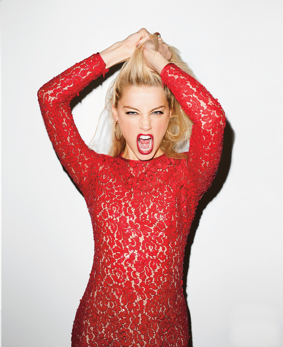
This is a photograph taken by photographer Terry Richardson of Amber Heard. Here, Amber has similar qualities to my model, e.g. blonde hair and blue eyes, and she also has red lips which is part of my costume and make up for my main model also. This picture caught my attention as the pose here is striking and the facial expression is full of attitude. This is something I aim to recreate as an image for my double page spread, as I feel an image such as this would effectively represent the character and persona of my artist as a female rapper. 

Thursday, 7 February 2013

Double Page Spread with Draft Article

This is my original draft double page spread, however I have included my draft article into the page as well to create more of a realistic image of what this spread will look like. Also, I removed the 'blended' image seen previously before in my first draft as the text was hard to read over it and therefore I felt that it needed to be removed. I have blended the 'L' for the same reason, so that the text is able to be read over the top of this, and so that it is not too predominant on the page.

Thursday, 31 January 2013

First Draft - Major Magazine


Feedback
This was marked by my teachers to give me a estimation of what this work would achieve if it was submitted and give me an idea of what level I am currently working at. I was given a level 2 for this work, which I was not happy with overall. The layout of the magazine was the main concern, especially in the contents page and double page spread. The list of sub-headings on the contents page following the line made by the wall was said to have no relevance to any other elements on the page and looked a lost on the page overall and didn't work. There were elements of the double page spread which I will have to change if I want to keep the same layout, such as considering how the text/main image will be cut due to the fold in the page. I have discussed these issues with my teachers and have decided upon possible changes that I could make in a second draft in order to gain a better grade. However, the style of my model was praised by my teachers and the shots that were taken were high-quality, and captured the attitude/character of the artist, which reflects the genre of my magazine well. The font for my masthead was also said to be strong and bold, and the contrast with the sub-heading made the two opposing fonts compliment eachother well.
I will have to make some significant changes to my magazine layout in order to achieve a higher mark and I am in the process of deciding upon a date for a second shoot with my model to get some different shots.

Monday, 21 January 2013

Double Page Spread Research


This spread is simple with a limited colour palette of black, white and red, with slight hints of alternate colour within the main image. The red of Lana Del Rey's hair subtly matches the 'Q' logo that appears in the bottom right corner of the page. The photo use as the main image takes up the space of a whole side of A4 and the effects used  on the image create a modern and sinister-looking page, along with her pose. The lighting used in the photo also makes the image more interesting, as it is different to the standard, clean cut image most commonly used in magazines. Another feature that I find interesting about this layout is the "S" in a bold font, as the first letter of the first word is 'S'. This is a common technique used by magazines and is similar to the 'L' in the background of the Lady Gaga article. This grabs the attention of the reader, rather than the article looking bland with columns of writing, and also entices the reader to continue.


This double page spread uses the most common colour palette used in magazines - red, white, and black - similar to that used in the Lana Del Rey article above. The main feature that caught my attention in this magazine was the writing on Soulja Boy's face, covered in the word 'Swag'. I think this idea is interesting and different, and it still incorporates the colour scheme of red, white, and black. The font is also consistent throughout the double page spread, as a handwritten font is used for the design on his face and the main heading/quotation on the following page. The design and layout of the page, including the font, reflects the attitude of the artist that the article is on (Soulja Boy), the genre of the magazine (Vibe), and attracts the target audience of this particular magazine, which would be teenagers interested in this genre of modern music.

This double page spread is also taken from Q magazine, and incorporates the common colour palette of red, white, and black - which is used in all three of the double page spread's that I have chosen to analyse. This is a modern and sophisticated style, as the main image is in monochrome and is a simple image. Lady Gaga is wearing nothing but chains around her neck and natural hair, creating a simplistic main image, however the make up that she is wearing is quite heavy on the eyes, hinting at a glamorous woman/lifestyle. On the following page, the article is in simple columns - the way a magazine article is expected to be laid out, however the bold, red 'L' in the background of the article catches the eye of the reader and is an interesting feature. This flash of colour creates a contrast from the, otherwise, monochrome colour scheme.