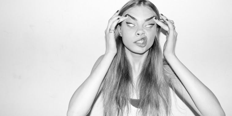
On my contents page, I have used a photo from the range of shots that I took for the preliminary magazine at the beginning of the course. I decided to use this photo because the style of the model is perfect for the genre of my magazine (hip-hop/urban) as he looks clean cut and smart. Also, the backdrop is blank and neutral, fitting in with the simple and stripped down style of the magazine overall, so the style of the shot is suitable for the contents page. The model is posing as a young, upcoming songwriter in the magazine and I feel that this photo captures that and it is convincing.
Showing posts with label update. Show all posts
Friday, 15 March 2013
Thursday, 14 March 2013
Double Page Spread Article Layout
On my double page spread I have decided to layout the article in to two columns rather than three. I have chosen to do this and go against the conventions of the typical music magazine because I think that having two columns of writing instead of three creates a de-cluttered, simple style, which coincides with the design on the front cover and the contents page. I attempted moving the text into three columns, however this looked too busy and was not consistent with the style of my previous pages. Therefore, after making adjustments I felt that it was best to use only two columns to continue with the modern, simple, stripped down design of my magazine.
Monday, 4 March 2013
New Contents Page Layout
I have reconsidered the layout of my contents page and changed it to a more conventional style layout, with the text down the left hand side of the page and images descending opposite. I have continued using the same font style and colours of the page numbers, however I reduced the size of the font and added more text within some of the subheadings. I am planning to schedule another shoot for two additional models that will feature on the contents page of the magazine however I have not yet done this so, for the time being, I have already planned where the photo's will go and have wrote 'photo' to show where the photo's will be placed on the page.
Thursday, 28 February 2013
Font Adjustment
After some consideration and feedback from teachers about the font I used for the subheading and strap line on my front cover and on the double page spread, I have decided to try different fonts to see if there was a different style font that would be more suitable and appropriate for my magazine. This font, 'Edition', is the best font that I found as it is bold and works well over the image, however does not distract the readers' attention from the masthead. The style of the font is also modern and links with my hip-hop/urban genre of the magazine, as it's different, simplistic and isn't the 'cheap' style of font that can sometimes be found on pop magazines etc.
Subscribe to:
Posts (Atom)


