Class
My second draft has recieved comments containing feedback from my peers in my class, stating what they like about my draft and what could be improved.
Firstly, the fonts I have chosen were praised by my peers and the contrast between the bold font for the masthead and the italic font for the sub-headings were highlighted in particular, as it was said that the two fonts compliment each other really well on the front cover.
The photograph's that I used for my draft were also praised as looking "high quality", "striking" and "professional" which is what is expected from a magazine that the reader is paying £4.20 for.
The colour scheme was also highlighted, as it makes the magazine look modern and adds to the simplistic style, therefore I feel more confident with my colour scheme and I will most definitely keep it as that throughout my future versions of my draft.
Improvements that have been suggested by peers in my class are that I could use a whiter background for the images of the model, and perhaps remove the shadow created by the models left arm by using photoshop, to make the shadow appear deliberate - which I did create on purpose.
Mr Nicolle
One of my teachers also stated his opinions on my draft and gave feedback also including what he liked and what he felt could be improved.
The front cover main image was praised as he felt that it was striking and powerful, which built the character of the artist really well. However, he said that I should attempt to cut out the shadow that is created by the lighting from the model's left arm. This looks accidental, unlike the shadow created by her face and on her right side.
On the contents page, he suggested changing the image at the bottom of the page because he felt that he didn't know what the image was saying about the artist's personality. As well as this, he mentioned adding an effect such as a 'mirror effect' to reflect the layout of the contents page as a whole. He praised the layout of the text on the contents page as it works well and is different to most magazines, which gives it a modern style.
Finally, on the double page spread, my teacher was concerned about the size of the paragraph's - especially the opening paragraph. In comparison to the following ones, the opening paragraph looks significantly long and does not look right on the page, therefore I should slightly chnage the layout of the text. However, he praised the image and the font used for the heading as it worked well together and created a persona for the artist. The shadow on the image creates a three-dimensional appearance of the magazine.
Mr Ford
After recieving feedback, my second draft is an improvement and a step in the right direction towards a final product.
Feedback on the front cover was: The masthead is slightly too big on the page, as well as the barcode being the wrong size. The font could also be changed as it doesn't look 100% right. The genre of hip-hop also is not clearly shown on the cover.
Contents page: A page number is needed, the text is also too big and the layout needs some more attention. To improve on the layout I could move the page numbers into the middle so that they are justified.
Double page spread: The margin on each side of the text and the top and bottom of the page needs to be bigger. The article also looks brief so needs to be of a greater length. As well as this, the font works less well over the main image than it does on the cover, so I should reconsider the font that I am using. I also need to credit the writer and photogrpaher on the double page spread.
Showing posts with label feedback. Show all posts
Showing posts with label feedback. Show all posts
Thursday, 21 February 2013

Saturday, 9 February 2013
Front Cover Image Idea for Second Draft

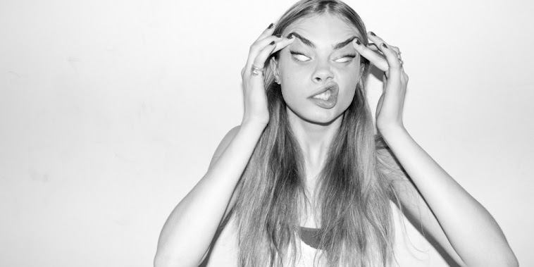
This is an image taken from the same HighSnobiety magazine that I focused on in my previous 'Inspiration' blog post. Initial feedback from my first draft suggested that I changed the image on the front cover as the models position on the page did not fit that of a typical magazine cover. I feel that the pose used in this shot would be a solution to this issue and it is still full of attitude that I wanted my model to show. My model will still be against a plain backdrop, however I will try and recreate this pose as I think this will improve my front cover and make an impact on the page.
Friday, 8 February 2013
Reasons for Improved Draft Article
On the post of my original draft my teacher commented that it was no way near long enough for my magazine double page spread. Therefore I have extended and developed my article to 644 words so that it is a more substantial amount for my article, however, my teacher then suggested to develop this further for my final draft of my magazine to at least 1,000 words. Then, this would give me the option to edit my article to fit the layout of the double page spread and would give me the opportunity to cut sections out or move it around etc. to fit the magazine, rather then having to make the magazine fit the article.
Tuesday, 29 January 2013
Evaluation of Class Feedback
As a result of giving my pitch on, both my teachers and peers gave feedback as to what they're opinion is on my initial idea for my magazine. Some raised questions and others praised elements of my magazine, which, consequently, gives me confidence to pursue that idea.
 One issue raised was the choice of model/s that would be the focus of the magazine and who would be on the front cover, contents page, and double page spread. This is a key choice as the model/s would be the main image and the focus of the whole magazine, and therefore if the model does not reflect the genre of the magazine, does not look aesthetically pleasing alongside the other elements of the magazine, or 'fit' the design, then this could have a negative effect on the whole magazine.
After discussing this issue with peers, I have decided to base my model/s appearance/clothing/attitude on that of the female rapper "Iggy Azalea". I have chosen this artist as a model to base my own model on, as she represents the modern urban/hip-hop genre that I am aspiring to achieve and always stars on interesting magazine covers/photo shoots.
The choice of title for my magazine gained a lot of praise from my peers and teachers after I presented my pitch. The name 'Major' has a lot of depth to it regarding the genre of the magazine, as the magazine will include major, and upcoming, hip-hop artists. As well as this, the fresh, young urban 'scene' is becoming a major genre in the music industry, developing in terms of music and image. The magazine will also be published majorly, overall creating a Major magazine. This depth and explanation of the title was praised and the impact of the word 'Major' alone was also mentioned. Therefore, I am confident that I will use this as a final title for my magazine.
 Another issue that was discussed as a result of my pitch was the location of which the photo's for my mock-up magazine will be taken. After consideration, I have decided that I will take the photo's with the model/s up against a blank wall or white screen to create a plain background, which can then be edited easily later on as a result. I wanted a simple mise-en-scene to create a modern appearance of the magazine and therefore a blank background would be suitable in achieving this.
I also discussed a price of £4.20 for my magazine, and the number of pages would be a minimum of 120. I think this is suitable considering the target audience, as the younger audience will still be able to afford the magazine at this price, however it is still at a price so that the magazine can be of high standard and quality and the pages can be glossy. The number of pages (120) would also be appropriate as it is a monthly magazine and therefore will be expected to have more content than a magazine that is released monthly, for example. The amount of content also reflects the price of £4.20.

After discussing this issue with peers, I have decided to base my model/s appearance/clothing/attitude on that of the female rapper "Iggy Azalea". I have chosen this artist as a model to base my own model on, as she represents the modern urban/hip-hop genre that I am aspiring to achieve and always stars on interesting magazine covers/photo shoots.
The choice of title for my magazine gained a lot of praise from my peers and teachers after I presented my pitch. The name 'Major' has a lot of depth to it regarding the genre of the magazine, as the magazine will include major, and upcoming, hip-hop artists. As well as this, the fresh, young urban 'scene' is becoming a major genre in the music industry, developing in terms of music and image. The magazine will also be published majorly, overall creating a Major magazine. This depth and explanation of the title was praised and the impact of the word 'Major' alone was also mentioned. Therefore, I am confident that I will use this as a final title for my magazine.
 Another issue that was discussed as a result of my pitch was the location of which the photo's for my mock-up magazine will be taken. After consideration, I have decided that I will take the photo's with the model/s up against a blank wall or white screen to create a plain background, which can then be edited easily later on as a result. I wanted a simple mise-en-scene to create a modern appearance of the magazine and therefore a blank background would be suitable in achieving this.
I also discussed a price of £4.20 for my magazine, and the number of pages would be a minimum of 120. I think this is suitable considering the target audience, as the younger audience will still be able to afford the magazine at this price, however it is still at a price so that the magazine can be of high standard and quality and the pages can be glossy. The number of pages (120) would also be appropriate as it is a monthly magazine and therefore will be expected to have more content than a magazine that is released monthly, for example. The amount of content also reflects the price of £4.20.
Subscribe to:
Posts (Atom)