Showing posts with label front cover. Show all posts
Monday, 29 April 2013
Thursday, 7 March 2013
Simple, Stripped Down Style Covers
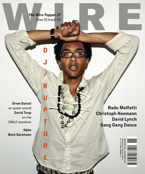
My magazine still incorporates a simple, modern and stripped down style as there is not a large amount of text or a variation of colours that feature on it. I used a colour pallette of black, white and red, avoiding any clashes of colour to keep the simple layout. The plain background used also is similar to the covers below as it is plain and neutral, also contributing to the simple, stripped down style. I took inspiration from magazines such as Dazed and Confused, Complex, i-D, and Wire. The examples below represent the style I was aiming to achieve and the inspiration that lead to the design of my front cover - they use simple fonts, colours and a limited amount of text is used. All of these features are stripped down and it creates, what I think is, a professional and modern style which coincides with the hip-hop genre really well. However, in the future editing of my magazine I aim to show a more dominant theme of music and of the hip-hop genre through the design of the front cover.
Tuesday, 26 February 2013
What I Hope to Achieve
Front cover
- Cut out the shadow made by the model's left arm
- Slightly reduce the size of the masthead
- Change the size of the barcode
- Experiment/change the font of the subheading and strap line
- Show a stronger sense of the hip-hop genre through the design
Contents page
- Change the image at the bottom of the page/possibly add a mirror effect
- Page number must be added
- Reduce the size of the text
- Move page numbers into the middle
- Reconsider layout
- Include more models
Double page spread
- Change the size of the opening paragraph
- Increase the margin on each side of the text and the top and bottom of the page
- Increase length of article
- Credit the writer and photographer
- Experiment/change font used over the main image
Wednesday, 13 February 2013
Second Draft - Major Magazine
After receiving feedback from my teacher about my first draft that I created for my magazine, I have decided to create a whole new second draft and make some drastic changes, especially to my contents page and double page spread. The main concern about my first draft was the major layout issues that I had not considered when designing it. For example, it was said that my contents page did not reflect that of a realistic music magazine and the way the list followed the slanted angle descending along the page was irrelevant. As well as this, major changes were needed to be done to my double page spread as I had not taken into consideration where the spread would be cut in half by the fold of the magazine (the font would be cut off in awkward places and the models face needed to adjusted so that the line cut her face directly in half). My contents page did not need drastically changing, however the models place on the page needed to be more central and the fonts to be resized, e.g. the masthead needed to be bigger and the headings/strap-lines to be smaller.
I had a second photo-shoot with my model, however kept the same style of costume as this was praised by my teachers and by peers, and got some new shots for the second draft. My main aim was to capture a more central image of my model for the front cover and to also gain more 'energetic', 'attitude' shots, which I feel I managed to capture quite well. The masthead was resized to a larger font, so it now goes across the width of the page, and the headings/strap-lines were resized to a smaller font. Along with the other small changes made, I believe this version of my cover is a more realistic, clean-cut, and modern layout than previously.
I completely changed the layout of my contents page. This layout is a more realistic representation of what a music magazine contents page would appear like, however I kept the fresh, modern appearance of a hip-hop/urban magazine genre. I still need to find a way of incorporating another model into the contents page to show a variety of artists, and so I will discuss this with my teacher in the next couple of lessons and will find a solution to this.
My double page spread was also drastically changed from the first draft. I went for a more classic layout in this draft, contrasting to the 'different' approach I attempted in my first draft. My idea was to use the classic, original layout and execute it perfectly to suit my genre of magazine, rather than try to do something 'unique' and it not pay off in the long-run. However, I still used a technique that I saw used in my double page spread analysis in the beginning of the course in the Lady Gaga article. The bold 'L' in the background of the article puts a twist on the design and hopefully differentiates it a little from others. I feel that this layout is a lot more flattering and is more aesthetically pleasing than my previous design.
Saturday, 9 February 2013
Front Cover Image Idea for Second Draft
This is an image taken from the same HighSnobiety magazine that I focused on in my previous 'Inspiration' blog post. Initial feedback from my first draft suggested that I changed the image on the front cover as the models position on the page did not fit that of a typical magazine cover. I feel that the pose used in this shot would be a solution to this issue and it is still full of attitude that I wanted my model to show. My model will still be against a plain backdrop, however I will try and recreate this pose as I think this will improve my front cover and make an impact on the page.
Wednesday, 6 February 2013
i-D Magazine
I love the covers of i-D Magazine because of the simple, modern layout on almost all of their covers. The models in this selection of covers are all in shot with a mid-shot and are in front of a plain backdrop, which is what I hope to incorporate into my front cover for Major. The colours are all simple and a colour palette of three is used on each, yet again this is what I'm hoping to use in the future drafts/final product, as I think this is more effective and aesthetically pleasing than a front cover which is made up of clashing colours and chaotic settings. i-D Magazine feature so many artists of different genres and even have models/fashion designers on their covers of each issue, however the design and shot manages to capture the energy and personality of each model, which is something that I admire from i-D. I hope to make my magazine reflect the style of these covers and this will heavily influence by final product.
Thursday, 31 January 2013
First Draft - Major Magazine
Feedback
This was marked by my teachers to give me a estimation of what this work would achieve if it was submitted and give me an idea of what level I am currently working at. I was given a level 2 for this work, which I was not happy with overall. The layout of the magazine was the main concern, especially in the contents page and double page spread. The list of sub-headings on the contents page following the line made by the wall was said to have no relevance to any other elements on the page and looked a lost on the page overall and didn't work. There were elements of the double page spread which I will have to change if I want to keep the same layout, such as considering how the text/main image will be cut due to the fold in the page. I have discussed these issues with my teachers and have decided upon possible changes that I could make in a second draft in order to gain a better grade. However, the style of my model was praised by my teachers and the shots that were taken were high-quality, and captured the attitude/character of the artist, which reflects the genre of my magazine well. The font for my masthead was also said to be strong and bold, and the contrast with the sub-heading made the two opposing fonts compliment eachother well.
I will have to make some significant changes to my magazine layout in order to achieve a higher mark and I am in the process of deciding upon a date for a second shoot with my model to get some different shots.
Monday, 28 January 2013
Magazine Cover Construction Task
The task was to construct a music magazine cover in one lesson. Here are the stages of creating my magazine and the final product.
I chose this image as it is an interesting shot of the artist Lana Del Rey. I minimized the image so that the model did not fill the entire cover, leaving little/no room for text. Then, I filled in the remaining background using the same colour of the original background of the picture, via use of the eye dropper tool.
'DEADLINE' appealed to me as a name for this magazine as it coincides with the main image, for example, the blood dripping from Lana Del Rey's mouth and the dead rose. The font is bold and unmissable to the reader and the colour white stands out above the dark colours used mainly for the main image, except for the pale colour of the model's face.

I wanted to keep the cover looking simplistic and modern. Therefore, I used the same font 'Zanzibar SF' for the masthead as well as the subheading and strapline, creating consistency throughout the cover. I also continued using the colour white to ensure this simplistic idea was to be effective.
For a realistic effect, I then added a barcode to the bottom right corner of the page. However, consequently, I moved the subheading and strapline slightly up, as the barcode looked too close to these seperate elements, creating a busy and messy appearance.
Wednesday, 16 January 2013
Magazine Research
Here are some magazine covers that I have researched that I liked/were attracted to/thought were interesting, and will give me inspiration for my own ideas.
Complex magazine - Kid Cudi is Mr Rager
This is one of my favourite magazine covers that Complex has done. The way that the photographer has played around with the background image and masthead is the best feature on the cover and is what the eye is drawn to initially. It gives the cover a 3D quality, and is a clever way of presenting a cover. The balance is right between text and layout here, because if there was any more text then I feel that the cover would become too busy and the audience would be drawn away from the background 'image'. The masthead if slowly distorted due to the image and makes this even more effective. Colours that are used in this palette mainly seem to consist of black, white and navy blue. The text makes the reader curious as to what the content of the magazine is, surrounding the idea that Kid Cudi is "out of control". This would attract the target audience of a young adult that is interested in this genre of music and any other media related topics/areas.
Ziggy magazine - Lana Del Rey cover
I love this cover just for it's simplicity. It appears to be quite a natural magazine cover, which is not over complicated like some designs may end up looking like. The background is plain, simple and a very neutral colour, which goes very nicely with the colour of Lana Del Rey's top and hair. Including Lana's make-up, nothing seems to be overdone in this cover. The masthead is bold and noticeable, coinciding with the interesting, out-of-the-ordinary name of the magazine. Even Lana Del Rey's pose seems natural and not 'forced' like some models that appear on the cover of a magazine that is to be viewed by millions. She is placed in the centre of the shot and is photographed using a medium close up, and if you look closely, there even seems to be a light coming off her, which slowly fades back to the darker [but still neutral] colour. All of this adds together to create an overall calm, simple, neutral and aesthetically pleasing magazine.
Spin magazine - Azealia Banks issue
This cover is a bit different to the other two, as it's a colourful, fun, and busy layout. It's also quite a feminine cover due to the background which appears to be a girly room (hinted by the baby pink walls and flowery curtains, which would definitely attract the female target audience), however, the colours of Azealia's green hair and multi-coloured clothing draw all of the attention to that main image. This clash of colours, alongside Azealia's pose/action, creates quite a busy cover but one that still works and is still aesthetically pleasing to the reader. Text is scarcely used except for the masthead, heading, and two subheadings, and the fonts are simple and bold - to balance out the busy image. From a magazine titled 'Spin', this cover is everything that is expected - a fun, busy, and colourful layout. It's different and that is one of the main reasons why I like it.
This is one of my favourite magazine covers that Complex has done. The way that the photographer has played around with the background image and masthead is the best feature on the cover and is what the eye is drawn to initially. It gives the cover a 3D quality, and is a clever way of presenting a cover. The balance is right between text and layout here, because if there was any more text then I feel that the cover would become too busy and the audience would be drawn away from the background 'image'. The masthead if slowly distorted due to the image and makes this even more effective. Colours that are used in this palette mainly seem to consist of black, white and navy blue. The text makes the reader curious as to what the content of the magazine is, surrounding the idea that Kid Cudi is "out of control". This would attract the target audience of a young adult that is interested in this genre of music and any other media related topics/areas.
Ziggy magazine - Lana Del Rey cover
I love this cover just for it's simplicity. It appears to be quite a natural magazine cover, which is not over complicated like some designs may end up looking like. The background is plain, simple and a very neutral colour, which goes very nicely with the colour of Lana Del Rey's top and hair. Including Lana's make-up, nothing seems to be overdone in this cover. The masthead is bold and noticeable, coinciding with the interesting, out-of-the-ordinary name of the magazine. Even Lana Del Rey's pose seems natural and not 'forced' like some models that appear on the cover of a magazine that is to be viewed by millions. She is placed in the centre of the shot and is photographed using a medium close up, and if you look closely, there even seems to be a light coming off her, which slowly fades back to the darker [but still neutral] colour. All of this adds together to create an overall calm, simple, neutral and aesthetically pleasing magazine.
Spin magazine - Azealia Banks issue
This cover is a bit different to the other two, as it's a colourful, fun, and busy layout. It's also quite a feminine cover due to the background which appears to be a girly room (hinted by the baby pink walls and flowery curtains, which would definitely attract the female target audience), however, the colours of Azealia's green hair and multi-coloured clothing draw all of the attention to that main image. This clash of colours, alongside Azealia's pose/action, creates quite a busy cover but one that still works and is still aesthetically pleasing to the reader. Text is scarcely used except for the masthead, heading, and two subheadings, and the fonts are simple and bold - to balance out the busy image. From a magazine titled 'Spin', this cover is everything that is expected - a fun, busy, and colourful layout. It's different and that is one of the main reasons why I like it.
Subscribe to:
Posts (Atom)