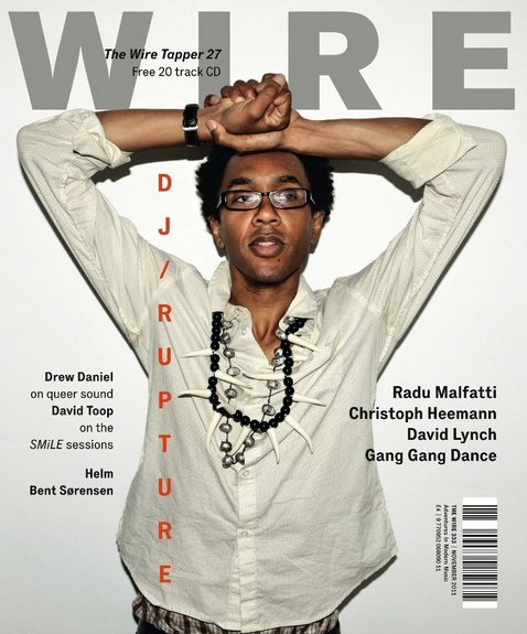
My magazine still incorporates a simple, modern and stripped down style as there is not a large amount of text or a variation of colours that feature on it. I used a colour pallette of black, white and red, avoiding any clashes of colour to keep the simple layout. The plain background used also is similar to the covers below as it is plain and neutral, also contributing to the simple, stripped down style. I took inspiration from magazines such as Dazed and Confused, Complex, i-D, and Wire. The examples below represent the style I was aiming to achieve and the inspiration that lead to the design of my front cover - they use simple fonts, colours and a limited amount of text is used. All of these features are stripped down and it creates, what I think is, a professional and modern style which coincides with the hip-hop genre really well. However, in the future editing of my magazine I aim to show a more dominant theme of music and of the hip-hop genre through the design of the front cover.
Showing posts with label research. Show all posts
Thursday, 7 March 2013
Wednesday, 6 February 2013
Inspiration
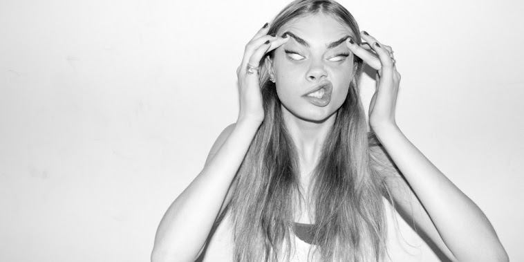
Issue 6 of HighSnobiety Magazine featured model Mimi Wade who is style by Lucy Greene and shot by Kimi Hammerstroem. There are two photo's that really stood out to me throughout the whole shoot and that have inspired me to reconsider the shots that I am going to do for my final magazine.
Firstly, I love this side shot of Mimi against a blank white wall. Her bright hair contrasts with the backdrop and her pose is natural, not forced. The side stance gives the shot an interesting edge and is something that I will definitely try with my model in my next shoot.
The next shot that caught my eye was this one. Although this is quite a busy image and contrasts with the simplistic and modern style that I am aiming for, I love the use of the border around the original image. It gives the image edge and differentiates it from the average photo. This is another technique that I could try in the future as I think, with the right border, it could look very effective and make my cover look even more aesthetically pleasing to the reader.
i-D Magazine
I love the covers of i-D Magazine because of the simple, modern layout on almost all of their covers. The models in this selection of covers are all in shot with a mid-shot and are in front of a plain backdrop, which is what I hope to incorporate into my front cover for Major. The colours are all simple and a colour palette of three is used on each, yet again this is what I'm hoping to use in the future drafts/final product, as I think this is more effective and aesthetically pleasing than a front cover which is made up of clashing colours and chaotic settings. i-D Magazine feature so many artists of different genres and even have models/fashion designers on their covers of each issue, however the design and shot manages to capture the energy and personality of each model, which is something that I admire from i-D. I hope to make my magazine reflect the style of these covers and this will heavily influence by final product.
Monday, 28 January 2013
Audience Research
UK Tribes research
This is an analysis of the audiences that I aim to appeal to through my magazine, found on the Channel 4 website UK Tribes, to give me more of an idea of what my audiences are attracted to and interested in when concerning the media.
Trendies
Trendies were once an exclusive tribe, populated only by those with the access, knowledge and cash to spend on fashion. Now almost anyone can be fashionable thanks to the speed with which trends fly off the catwalk and into high street stores. The Trendies Tribe is increasing and with growth comes dilution and the potential for a reaction against this. How can Trendies be trendy if everyone is cool?
The aesthetic awareness and thirst for new trends is blossoming across youth culture and drawing in new members. Accordingly, having the newest look or knowing about the newest trend is easier but means less than it did ten years ago. It's still important for the older section of Britain's youth though – Trendies tend to be in their early/mid 20s and are generally middle class. The Trendies Tribe is growing so significantly that fashionistas, a term once used solely to describe east London would-be stylists and fashion darlings, is growing in currency across the UK and is now used in more general terms to describe a more-trendy-than-average trendy.
It's all about vintage for trendies. One-off pieces from eBay or charity finds are key, combined with staples from Topshop, H&M, Primark and Urban Outfitters, and designer goods which are increasingly pitched as realistic options for Trendies, like Acne, Luella, See by Chloe and Folk. Fashion heroes are Alexa Chung, Kate Moss and Daisy Lowe. Musically, Trendies are drawn to whatever is fashionable and tend to like things in the period just prior to their first hit and the release of their second album. They tend to like acts that are just about to make it big and once they have gained complete mainstream status, they move on.
Urban
Urban music is the most pervasive and influential genre in popular music, topping the charts around the world and sound-tracking the lives of many different Tribes. Members of the Urban segment are therefore very close to one of the biggest cultural signifiers in the youth market – although in planning terms, genuine Urban segment members make up a small slice of the market.
The Urban segment follows a typical pattern, with a small subset (the DIY-ers) who create and dictate tastes, and consumers who buy into the tribe and endorse that creativity in the shape of Blingers, Get Paid Crew and Trackies. Urban fashion and music extends into mainstream publishing and TV, but the core Tribe members are most influenced by what they see around them in their urban environments, in clubs and on social networks. YouTube, Myspace and Facebook are the most effective conduit to these kids.
Trackies are enthusiasts who don’t produce but enjoy consuming music and film with their friends. Their hooded tops are intimidating but their conversation is friendly, open-minded and laid back. Blingers are preoccupied with US music and icons, and spend big on label fashion. They are sometimes mocked, but everyone has a bit of Blinger in them. Get Paid Crew are a brash version of the traditional working classes, unashamedly driven by money but proud of their urban background. DIYers have identified the core of their lives, understanding their own culture and making music and media for themselves, with a lively local market and occasional global break-outs.
Leading Edge
Leading Edge tribes are the smallest segment in the youth market. However, they drive taste across virtually all other sectors, impacting on the listening habits and fashions of everyone from rural teenage Emos to the stars of US hip hop. These tribes stand at the gateway of popular culture, and are the main influence over other Tribes like the Young Alts. However, all of these Leading Edge Tribes are hard to manipulate.
This is an analysis of the audiences that I aim to appeal to through my magazine, found on the Channel 4 website UK Tribes, to give me more of an idea of what my audiences are attracted to and interested in when concerning the media.
Trendies
Trendies were once an exclusive tribe, populated only by those with the access, knowledge and cash to spend on fashion. Now almost anyone can be fashionable thanks to the speed with which trends fly off the catwalk and into high street stores. The Trendies Tribe is increasing and with growth comes dilution and the potential for a reaction against this. How can Trendies be trendy if everyone is cool?
The aesthetic awareness and thirst for new trends is blossoming across youth culture and drawing in new members. Accordingly, having the newest look or knowing about the newest trend is easier but means less than it did ten years ago. It's still important for the older section of Britain's youth though – Trendies tend to be in their early/mid 20s and are generally middle class. The Trendies Tribe is growing so significantly that fashionistas, a term once used solely to describe east London would-be stylists and fashion darlings, is growing in currency across the UK and is now used in more general terms to describe a more-trendy-than-average trendy.
It's all about vintage for trendies. One-off pieces from eBay or charity finds are key, combined with staples from Topshop, H&M, Primark and Urban Outfitters, and designer goods which are increasingly pitched as realistic options for Trendies, like Acne, Luella, See by Chloe and Folk. Fashion heroes are Alexa Chung, Kate Moss and Daisy Lowe. Musically, Trendies are drawn to whatever is fashionable and tend to like things in the period just prior to their first hit and the release of their second album. They tend to like acts that are just about to make it big and once they have gained complete mainstream status, they move on.
Urban
Urban music is the most pervasive and influential genre in popular music, topping the charts around the world and sound-tracking the lives of many different Tribes. Members of the Urban segment are therefore very close to one of the biggest cultural signifiers in the youth market – although in planning terms, genuine Urban segment members make up a small slice of the market.
The Urban segment follows a typical pattern, with a small subset (the DIY-ers) who create and dictate tastes, and consumers who buy into the tribe and endorse that creativity in the shape of Blingers, Get Paid Crew and Trackies. Urban fashion and music extends into mainstream publishing and TV, but the core Tribe members are most influenced by what they see around them in their urban environments, in clubs and on social networks. YouTube, Myspace and Facebook are the most effective conduit to these kids.Trackies are enthusiasts who don’t produce but enjoy consuming music and film with their friends. Their hooded tops are intimidating but their conversation is friendly, open-minded and laid back. Blingers are preoccupied with US music and icons, and spend big on label fashion. They are sometimes mocked, but everyone has a bit of Blinger in them. Get Paid Crew are a brash version of the traditional working classes, unashamedly driven by money but proud of their urban background. DIYers have identified the core of their lives, understanding their own culture and making music and media for themselves, with a lively local market and occasional global break-outs.
Leading Edge
Leading Edge tribes are the smallest segment in the youth market. However, they drive taste across virtually all other sectors, impacting on the listening habits and fashions of everyone from rural teenage Emos to the stars of US hip hop. These tribes stand at the gateway of popular culture, and are the main influence over other Tribes like the Young Alts. However, all of these Leading Edge Tribes are hard to manipulate.
Inspiration
Melissa Bell and Katherine Webster in "She Got Game", shot by Tim Ashton for Fashion Gone Rogue. Styled by Monique Moynihan, the shoot features designers such as Just Cavalli, Addidas Originals X Jeremy Scott, Ksubi, and Nike.
I particularly like this shoot as it incporates a plain white background, which is what I intend to use in my magazine shoot, however then contrasts this with bold, busy, clashing and colourful costume worn by the models. There is also a varied use of camera shots, including mid-shots and long-shots, with one or two models used in each shot - which is the number that I intend to use, as noted in my pitch. As well as this, the models are in interesting poses and Tim Ashton captures these well in his photograph's - this is something I hope to present in my shoot for 'Major' Magazine. The costume used in this "She Got Game" shoot also reflects the genre of fresh urban/hip-hop that my magazine focuses on, so is yet again something I can think about when considering the costume of my model/s for my magazine.


Friday, 25 January 2013
Audience Profile
I have decided that my magazine will be targeted at both male and female audiences, in the age range of 16-25 years old. The genre of music I have chosen is hip-hop/urban, however also focusing on upcoming and major [mainstream] artists. Therefore, my target audience will reflect the genre of the magazine.
For example;
Ellie
Ellie is an 18 year old sixth former who walks each step with her white Dr. Dre Beats hung around her neck, the bass of 'Dirt Off Your Shoulder' by Jay-Z occasionally blasting out of them. Her Twitter feed consists of the news from Complex magazine, life lessons from Kid Cudi, Azealia Bank's arguments and the rare tweets from Kanye West. The day she went to the Watch the Throne tour was one of the best days of her life so far. Her friends describe her as an 'Annie Mac wannabe', creating mix tapes of all her favourite tracks, alongside her school work and partying. Ellie is a fashionable girl, forever wishing that one day she'll wake up with a Givenchy top hanging up in her wardrobe. However, even without the Givenchy piece, she still manages to throw together an outfit each day and strolls into school, usually in her skinny jeans, tee, leather jacket and a fresh backpack.
Joe
Joe is 21 years old and in his final year at the University of Sheffield studying journalism. His flat is a mess, the only decoration being his cherished Sony speakers in his bedroom and the pile of Complex and i-D Magazines in the corner, and he lives everyday listening to the artist of tomorrow. Frequently posting on his blog, he writes about new artists on the scene and has a passion for the hip-hop/urban culture. He lives everyday like there's no tomorrow and makes the most of his uni-freedom, described by his mates as a 'typical lad with a taste for good music'.
For example;
Ellie
Ellie is an 18 year old sixth former who walks each step with her white Dr. Dre Beats hung around her neck, the bass of 'Dirt Off Your Shoulder' by Jay-Z occasionally blasting out of them. Her Twitter feed consists of the news from Complex magazine, life lessons from Kid Cudi, Azealia Bank's arguments and the rare tweets from Kanye West. The day she went to the Watch the Throne tour was one of the best days of her life so far. Her friends describe her as an 'Annie Mac wannabe', creating mix tapes of all her favourite tracks, alongside her school work and partying. Ellie is a fashionable girl, forever wishing that one day she'll wake up with a Givenchy top hanging up in her wardrobe. However, even without the Givenchy piece, she still manages to throw together an outfit each day and strolls into school, usually in her skinny jeans, tee, leather jacket and a fresh backpack.
Joe
Joe is 21 years old and in his final year at the University of Sheffield studying journalism. His flat is a mess, the only decoration being his cherished Sony speakers in his bedroom and the pile of Complex and i-D Magazines in the corner, and he lives everyday listening to the artist of tomorrow. Frequently posting on his blog, he writes about new artists on the scene and has a passion for the hip-hop/urban culture. He lives everyday like there's no tomorrow and makes the most of his uni-freedom, described by his mates as a 'typical lad with a taste for good music'.
Tuesday, 22 January 2013
Monday, 21 January 2013
Possible Colour Palettes
Moodboard - Animoto
Make your own photo slideshow at Animoto.
Double Page Spread Research
This spread is simple with a limited colour palette of black, white and red, with slight hints of alternate colour within the main image. The red of Lana Del Rey's hair subtly matches the 'Q' logo that appears in the bottom right corner of the page. The photo use as the main image takes up the space of a whole side of A4 and the effects used on the image create a modern and sinister-looking page, along with her pose. The lighting used in the photo also makes the image more interesting, as it is different to the standard, clean cut image most commonly used in magazines. Another feature that I find interesting about this layout is the "S" in a bold font, as the first letter of the first word is 'S'. This is a common technique used by magazines and is similar to the 'L' in the background of the Lady Gaga article. This grabs the attention of the reader, rather than the article looking bland with columns of writing, and also entices the reader to continue.
This double page spread uses the most common colour palette used in magazines - red, white, and black - similar to that used in the Lana Del Rey article above. The main feature that caught my attention in this magazine was the writing on Soulja Boy's face, covered in the word 'Swag'. I think this idea is interesting and different, and it still incorporates the colour scheme of red, white, and black. The font is also consistent throughout the double page spread, as a handwritten font is used for the design on his face and the main heading/quotation on the following page. The design and layout of the page, including the font, reflects the attitude of the artist that the article is on (Soulja Boy), the genre of the magazine (Vibe), and attracts the target audience of this particular magazine, which would be teenagers interested in this genre of modern music.
This double page spread is also taken from Q magazine, and incorporates the common colour palette of red, white, and black - which is used in all three of the double page spread's that I have chosen to analyse. This is a modern and sophisticated style, as the main image is in monochrome and is a simple image. Lady Gaga is wearing nothing but chains around her neck and natural hair, creating a simplistic main image, however the make up that she is wearing is quite heavy on the eyes, hinting at a glamorous woman/lifestyle. On the following page, the article is in simple columns - the way a magazine article is expected to be laid out, however the bold, red 'L' in the background of the article catches the eye of the reader and is an interesting feature. This flash of colour creates a contrast from the, otherwise, monochrome colour scheme.
Saturday, 19 January 2013
Contents Page Research
The background consists of plain and basic colours so that this allows the foreground of the model and the text to stand out as the main features of this contents page. The masthead is in a bold font and in bright white to contrast with the dark background to catch the attention of the reader. The white outline of the 'V' in the background of the page also connects to the models legs, which are also in the shape of a 'V', repeating the title of the magazine. This contents page uses a neutral colour palette consisting of browns, whites and blacks, keeping the page simplistic. The models pose is unusual, as she is laying down rather than the standard stood up pose, this draws attention to the model and makes her the main image on the page. The text is split into two headings - features and fashion - making it easier for the reader to find what they're looking for quickly.
This contents page is also from Vibe magazine and it also caught my eye when I was researching. There is a monochrome colour palette used for this page, however there is a splash of bright red from the heart held by the mysterious arm emerging from behind Kanye. This could make a subtle hint to the reader that stories about Kanye's personal love life could be revealed in the issue. The use of a bright colour in amongst a monochrome palette can sometimes look cliché or 'tacky' but Vibe magazine uses the technique successfully and makes it look effective. Yet again there is a faint 'V' in the background of the page and the 'Contents' heading is in the same font and layout, giving the loyal reader familiarity with the magazine. As well as this, the headings are laid out in the same way and are the same as previously - features and fashion.
This page is very different to a normal layout of a contents page, which is why it caught my attention. The majority of the page is taken up by the main image, enticing the reader to what else is to come later in the magazine. Keeping it simple, the colour palette is just black and white, with very slight hints of different colour in the main image - keeping the colours simple makes the page look clean, de-cluttered, and easy to follow. The font used for the text is also very simple and so contributes to this clean cut style. In the top left corner of the page, there are numbers instead of the usual title of the magazine, being 'Nylon'. I guessed that these numbers would represent the date and issue number of the magazine, which contributes to the unique layout of the page.
Wednesday, 16 January 2013
Magazine Research
Here are some magazine covers that I have researched that I liked/were attracted to/thought were interesting, and will give me inspiration for my own ideas.
Complex magazine - Kid Cudi is Mr Rager
This is one of my favourite magazine covers that Complex has done. The way that the photographer has played around with the background image and masthead is the best feature on the cover and is what the eye is drawn to initially. It gives the cover a 3D quality, and is a clever way of presenting a cover. The balance is right between text and layout here, because if there was any more text then I feel that the cover would become too busy and the audience would be drawn away from the background 'image'. The masthead if slowly distorted due to the image and makes this even more effective. Colours that are used in this palette mainly seem to consist of black, white and navy blue. The text makes the reader curious as to what the content of the magazine is, surrounding the idea that Kid Cudi is "out of control". This would attract the target audience of a young adult that is interested in this genre of music and any other media related topics/areas.
Ziggy magazine - Lana Del Rey cover
I love this cover just for it's simplicity. It appears to be quite a natural magazine cover, which is not over complicated like some designs may end up looking like. The background is plain, simple and a very neutral colour, which goes very nicely with the colour of Lana Del Rey's top and hair. Including Lana's make-up, nothing seems to be overdone in this cover. The masthead is bold and noticeable, coinciding with the interesting, out-of-the-ordinary name of the magazine. Even Lana Del Rey's pose seems natural and not 'forced' like some models that appear on the cover of a magazine that is to be viewed by millions. She is placed in the centre of the shot and is photographed using a medium close up, and if you look closely, there even seems to be a light coming off her, which slowly fades back to the darker [but still neutral] colour. All of this adds together to create an overall calm, simple, neutral and aesthetically pleasing magazine.
Spin magazine - Azealia Banks issue
This cover is a bit different to the other two, as it's a colourful, fun, and busy layout. It's also quite a feminine cover due to the background which appears to be a girly room (hinted by the baby pink walls and flowery curtains, which would definitely attract the female target audience), however, the colours of Azealia's green hair and multi-coloured clothing draw all of the attention to that main image. This clash of colours, alongside Azealia's pose/action, creates quite a busy cover but one that still works and is still aesthetically pleasing to the reader. Text is scarcely used except for the masthead, heading, and two subheadings, and the fonts are simple and bold - to balance out the busy image. From a magazine titled 'Spin', this cover is everything that is expected - a fun, busy, and colourful layout. It's different and that is one of the main reasons why I like it.
This is one of my favourite magazine covers that Complex has done. The way that the photographer has played around with the background image and masthead is the best feature on the cover and is what the eye is drawn to initially. It gives the cover a 3D quality, and is a clever way of presenting a cover. The balance is right between text and layout here, because if there was any more text then I feel that the cover would become too busy and the audience would be drawn away from the background 'image'. The masthead if slowly distorted due to the image and makes this even more effective. Colours that are used in this palette mainly seem to consist of black, white and navy blue. The text makes the reader curious as to what the content of the magazine is, surrounding the idea that Kid Cudi is "out of control". This would attract the target audience of a young adult that is interested in this genre of music and any other media related topics/areas.
Ziggy magazine - Lana Del Rey cover
I love this cover just for it's simplicity. It appears to be quite a natural magazine cover, which is not over complicated like some designs may end up looking like. The background is plain, simple and a very neutral colour, which goes very nicely with the colour of Lana Del Rey's top and hair. Including Lana's make-up, nothing seems to be overdone in this cover. The masthead is bold and noticeable, coinciding with the interesting, out-of-the-ordinary name of the magazine. Even Lana Del Rey's pose seems natural and not 'forced' like some models that appear on the cover of a magazine that is to be viewed by millions. She is placed in the centre of the shot and is photographed using a medium close up, and if you look closely, there even seems to be a light coming off her, which slowly fades back to the darker [but still neutral] colour. All of this adds together to create an overall calm, simple, neutral and aesthetically pleasing magazine.
Spin magazine - Azealia Banks issue
This cover is a bit different to the other two, as it's a colourful, fun, and busy layout. It's also quite a feminine cover due to the background which appears to be a girly room (hinted by the baby pink walls and flowery curtains, which would definitely attract the female target audience), however, the colours of Azealia's green hair and multi-coloured clothing draw all of the attention to that main image. This clash of colours, alongside Azealia's pose/action, creates quite a busy cover but one that still works and is still aesthetically pleasing to the reader. Text is scarcely used except for the masthead, heading, and two subheadings, and the fonts are simple and bold - to balance out the busy image. From a magazine titled 'Spin', this cover is everything that is expected - a fun, busy, and colourful layout. It's different and that is one of the main reasons why I like it.
Subscribe to:
Posts (Atom)