
Tuesday, 9 April 2013

Friday, 22 March 2013
Friday, 15 March 2013
Contents Page Photo's

On my contents page, I have used a photo from the range of shots that I took for the preliminary magazine at the beginning of the course. I decided to use this photo because the style of the model is perfect for the genre of my magazine (hip-hop/urban) as he looks clean cut and smart. Also, the backdrop is blank and neutral, fitting in with the simple and stripped down style of the magazine overall, so the style of the shot is suitable for the contents page. The model is posing as a young, upcoming songwriter in the magazine and I feel that this photo captures that and it is convincing.
Thursday, 14 March 2013
Double Page Spread Article Layout
On my double page spread I have decided to layout the article in to two columns rather than three. I have chosen to do this and go against the conventions of the typical music magazine because I think that having two columns of writing instead of three creates a de-cluttered, simple style, which coincides with the design on the front cover and the contents page. I attempted moving the text into three columns, however this looked too busy and was not consistent with the style of my previous pages. Therefore, after making adjustments I felt that it was best to use only two columns to continue with the modern, simple, stripped down design of my magazine.
Monday, 11 March 2013
Photoshop Work
In this screen shot I am editing some features on my double page spread. I am increasing the size of the margin either side of the article and at the top and bottom of the article. As well as this, minor changes need to be made to the article itself, due to a rethink in the writing.


Thursday, 7 March 2013
Simple, Stripped Down Style Covers
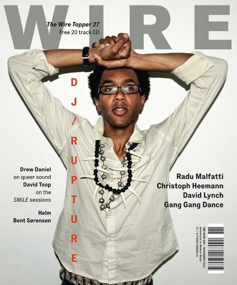
My magazine still incorporates a simple, modern and stripped down style as there is not a large amount of text or a variation of colours that feature on it. I used a colour pallette of black, white and red, avoiding any clashes of colour to keep the simple layout. The plain background used also is similar to the covers below as it is plain and neutral, also contributing to the simple, stripped down style. I took inspiration from magazines such as Dazed and Confused, Complex, i-D, and Wire. The examples below represent the style I was aiming to achieve and the inspiration that lead to the design of my front cover - they use simple fonts, colours and a limited amount of text is used. All of these features are stripped down and it creates, what I think is, a professional and modern style which coincides with the hip-hop genre really well. However, in the future editing of my magazine I aim to show a more dominant theme of music and of the hip-hop genre through the design of the front cover.




Subscribe to:
Posts (Atom)