


After receiving feedback from my teacher about my first draft that I created for my magazine, I have decided to create a whole new second draft and make some drastic changes, especially to my contents page and double page spread. The main concern about my first draft was the major layout issues that I had not considered when designing it. For example, it was said that my contents page did not reflect that of a realistic music magazine and the way the list followed the slanted angle descending along the page was irrelevant. As well as this, major changes were needed to be done to my double page spread as I had not taken into consideration where the spread would be cut in half by the fold of the magazine (the font would be cut off in awkward places and the models face needed to adjusted so that the line cut her face directly in half). My contents page did not need drastically changing, however the models place on the page needed to be more central and the fonts to be resized, e.g. the masthead needed to be bigger and the headings/strap-lines to be smaller.
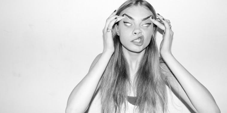
I had a second photo-shoot with my model, however kept the same style of costume as this was praised by my teachers and by peers, and got some new shots for the second draft. My main aim was to capture a more central image of my model for the front cover and to also gain more 'energetic', 'attitude' shots, which I feel I managed to capture quite well. The masthead was resized to a larger font, so it now goes across the width of the page, and the headings/strap-lines were resized to a smaller font. Along with the other small changes made, I believe this version of my cover is a more realistic, clean-cut, and modern layout than previously.
I completely changed the layout of my contents page. This layout is a more realistic representation of what a music magazine contents page would appear like, however I kept the fresh, modern appearance of a hip-hop/urban magazine genre. I still need to find a way of incorporating another model into the contents page to show a variety of artists, and so I will discuss this with my teacher in the next couple of lessons and will find a solution to this.
My double page spread was also drastically changed from the first draft. I went for a more classic layout in this draft, contrasting to the 'different' approach I attempted in my first draft. My idea was to use the classic, original layout and execute it perfectly to suit my genre of magazine, rather than try to do something 'unique' and it not pay off in the long-run. However, I still used a technique that I saw used in my double page spread analysis in the beginning of the course in the Lady Gaga article. The bold 'L' in the background of the article puts a twist on the design and hopefully differentiates it a little from others. I feel that this layout is a lot more flattering and is more aesthetically pleasing than my previous design.
I like this a lot. The font for 'Major' works really well- it's bold and stands out. The italic for the subheading's also works well- it's a good contrast. All your pictures are of high quality. I really like the transparent 'L' on your article- it looks professional.
ReplyDeleteI agree with Meg that the choice of fonts on the cover compliment each other really well, and your choice of images are striking and look professional, which portray the 'urban' genre you were aiming to achieve. The colour scheme is simple yet bold, and all of the layouts are consistently good throughout and represent a 'modern' style. The text side of the double page spread, in particular, looks fantastic.
ReplyDeleteI really like how well it all comes together - The images and the for work really well throughout all of the pages and the colour scheme is effective. The makeup and costume for the model are also rally well though out and fit the genre of your magazine - I thought of Azelia Banks. The simplicity overall is effective, and the contents page is different from most which again works really well.
ReplyDeleteI think that it all works really well together. The consistent colour scheme of grey white and black running through the product makes it look really professional and goes well with the hip hop genre that you were going for. The poses and facial expressions by the model look really good as they show her with a bit of an attitude which is important in this genre
ReplyDeleteI really like how you've styled the model, I think this style really suits the overall genre of the magazine. I really like the title of the magazine and the contrast of grey on white really makes the title stand out and draws the eye towards it. I think that the contents page is very original and I really like the layout. On the double page, I think the 'L' really looks good on the 1st page. I think maybe you could remove the shadow on Photoshop or use a whiter background with brighter lighting on the artist's photo.
ReplyDelete