
What went well
- Costume/style of model
- Colour scheme (Black, white, and red)
- Models place on the page
- Title of magazine and the font it
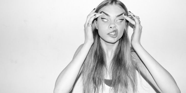
- The lighting which created the shadow falling onto the backdrop from the models right hand side - This gives it a three dimensional look
Even better if
- Experiment with different fonts for the heading and strapline
- Cut out the shadow that is made from the models left arm, as this looks accidental
Contents Page
What went well
 There is consistency with the font of the masthead on the front cover with the title 'contents' and subheadings, linking the pages together
- The 'mirror image' layout of the subheadings and description
- Colour scheme is consistent (Black, white, and red)
- Classic font used works well with the 'Lemondrop' font that is associated with the magazine

Even better if
- Change the image at the bottom of the page
- Incorporate different models into the layout of the page
Double page spread
What went well
- The main image reflects and builds a representation of the artist's character/personality
- The faded 'L' in the background of the article creates an interesting feature
- Colour scheme is consistent (Black, white, and red)
- Font works well against the image and assists in creating a modern/simple design
 The shadow, deliberately created through the use of lighting, creates a three dimensional appearance

Even better if
- Change the size of the first paragraph of the article as it is significantly long for an opening paragraph and looks out of proportion in comparison to the following paragraphs
This comment has been removed by the author.
ReplyDeleteThis is an improvement and a real step in the right direction.
ReplyDeleteCover: masthead looks slightly too big.
Barcode is still the wrong size (look at real mags for help). Still not sure about the font on the cover. Also not sure how 'hip hop' the whole thing is.
Contents: Page number needed. text is too big and layout still needs attention. Maybe put the numbers in the middle so they are justified.
DPS: you need to have a bigger margin on each side of the text and at the top and bottom of the page. The article also looks a bit brief (how many words?) The font over the image works less well than it does on the cover.
Credit the writer and photographer.